
Calculator HTML & CSS Exercise
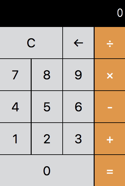
Our goal is to create a calculator that looks exactly like this image:
Exercise Files
Download the calculator exercise files, including the beginning state, ending state, instructions, and specification for how the calculator should look:
https://github.com/FrontendMasters/bootcamp/tree/master/static/exercises/5-github.zip
We are focusing this lesson on creating the HTML and CSS for the caclulator. In a future lesson we will make it interactive with JavaScript.
A few Things To Know About This Calculator:
To Get Symbols for Math, You'll Need to Look Up Their HTML Codes
One place to do that is here:
The Calculator Buttons Should Be Clickable
You'll program them later in the course with JavaScript. But for right now, somehow we need to code clickable buttons.
Colors used in this design include:
-
black: #000000
-
white: #ffffff
-
light grey: #d8d9db
-
buttons on hover: #ebebeb
-
button active state: #bbbcbe
-
function buttons: #df974c
-
function buttons on hover: #dfb07e
-
function button active state: #dd8d37
-
The overall width of this calculator is 400px.
Suggested approach:
- Create a wrapper with a width of 400px to set up the calculator.
- Determine how many rows and columns we need.
- Identify elements that occupy more than one column.
- Determine the HTML tags required to code rows and cells.
- Code a single row of 4 elements to start with and see if you can get that working.
- Now add the other rows of 4 elements.
- Finally, add the rows where there are fewer than 4 elements. What do you need to adjust to get these to work?
- Once your layout is mostly working, add the colors and make it pretty.
HTML and CSS Tips and Hints
- Programming is all about taking large problems and breaking them into smaller problems. If you're trying to tackle too much at once, break it into two smaller problems and try to solve one of those.
- Personally, I wrote the HTML and CSS first. Once that's all taken care of, then I do the JavaScript.
- For the font of the "result screen" I'd just use
monospace. - There are so many ways to write this. There is no one right way. My solution is not the only nor is it the best solution. Experiment. Try. Fail. Succeed. It's all about learning here.
- Good idea to use
<button></button>for the buttons. You have to deal with some extra styling stuff but it will make your code work pretty much automatically for disabled people. In general when writing HTML, if something serves the function of a button, make it a<button></button>. - I used multiple rows of flex layed out divs for the button. You could do it all in one div using the
flex-wrapproperty. - The secret to getting equal gutters (which is what you call the black space between buttons): you can set width to be
24.5%(so four of them fit on a line) and then usejustify-cotent: space-betweento evenly space them. That'll give them a gutter of roughly.5%of the whole width. The problem with using percentages in conjuections with heights: your heights and widths are different. 5% of height is not the same of 5% of width, and that'll make the gutters look weird. You want the bottom gutters to be the same size as the side gutters.margin-bottomto the resuce! If you give the row amargin-bottomof.5%(if you're using my same numbers) then that'll work since margin is always measured as a function of width (just one of those things you have to know!) Hopefully that helps. - Sometimes I do the math to get things right. Sometimes I just guess-and-check to see if it looks okay.
- You can add a class to get the orange buttons. Or you could try
:last-child(assuming you have row div.)
Good luck!